
Epiphany illustration – 2020
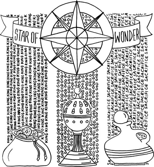
Kiri’s illustration for epiphany draws out the meaning of the gifts that the wise men brought to Jesus
See other creative items relating to illustration
Kiri and Steve.co.uk

Over the years, together we’ve dabbled in graphic design, photography + film work, illustration, and web design + code, trading first as sole traders with our own small businesses, then combining them to form a partnership under the name Lightbulb Head. Since having children we’ve folded the business so aren’t currently earning money from our creativity, but that hasn’t stopped us from creating.
In this section there’s a selection of some of the projects that we’ve worked on over the years – scroll down for the most recent, or use the categories on the left to see specific projects.
Kiri’s illustration for epiphany draws out the meaning of the gifts that the wise men brought to Jesus
See other creative items relating to illustration
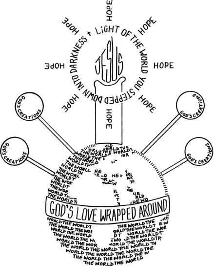
Kiri’s illustration of a Christingle draws out the meaning of the orange, the ribbon, the fruits and the candle
See other creative items relating to illustration
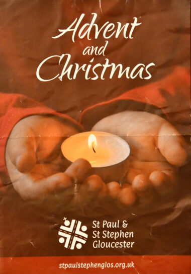
Kiri designed this flyer for our church and Steve took the photo. There had been a deliberate request that specific dates and times of services weren’t included on the flyer, so that it could be re-used for future years.
See other creative items relating to graphic design, photography / film
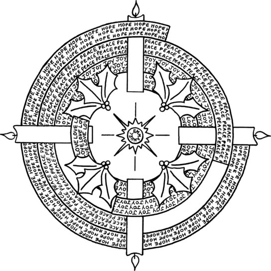
Kiri drew this as the first in the series of illustrations matching the church year. This advent wreath illustration draws out the traditional meanings of the four candles of hope, peace, joy and love, with the final
See other creative items relating to illustration
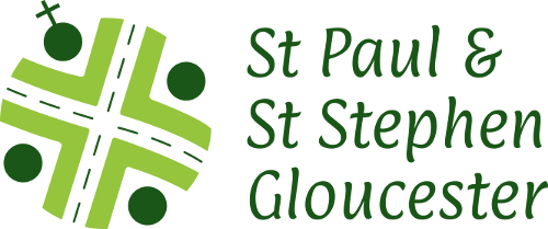
In 2019 we re-designed the logo of St Paul and St Stephen’s church, Gloucester. The three themes that the congregation wanted to be communicated through the logo were the physical location, community and transformation. The shape and angle of the main cross that runs through the centre of the new logo is directly taken from a map of the crossroads on Stroud Road, at which St Paul and St Stephen’s stands. The OS map symbol for a church can be seen in the top left quadrant of the cross, in the exact position in which the church can be found if the logo is viewed as a map. The main cross shape shows that Jesus is at the centre of the church and community. In a lighter shade of green, four arrows point towards the centre, these symbolise inclusivity and welcome, inviting people from all walks of life to join the church. Viewed along with the four circles in darker green, these arrows become people with their arms raised in praise. The colour green represents growth, renewal and new life. Green is also the colour used to represent ‘ordinary time’ within the church year.
See other creative items relating to graphic design, logo
In 2017, we wrote a small python script for a RaspberryPi that would take a photo every 15 minutes in the daytime (calculated based on the python astral library) using an attached webcam and add a watermark and upload the picture to the web. Then, once a month in the hours of darkness, the code would generate a video timelapse (averaging the white balance of each picture) and upload that to the web. In 2018, we set up a raspberry pi and webcam in the orchard at Penhurst Retreat Centre and set it going… with limited success! The above is one of the resulting videos where the whole month worked!
See other creative items relating to photography / film, timelapse
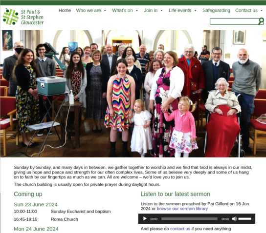
In 2018 we re-designed and re-wrote the website for St Paul and St Stephen’s church in Gloucester. This was our first “mobile-first” web design where we designed it first for mobile devices, then adapted it for larger screens. We drew on much of the functionality of the St Mark’s website – the events calendar, the highlights on the front page, but we also brought the latest sermon recording onto the front page too. We also wanted all of the key information for a new visitor visible on every page, so we designed the footer of each page to have service times, contact details and a map of where the church is
See other creative items relating to code, web design / code
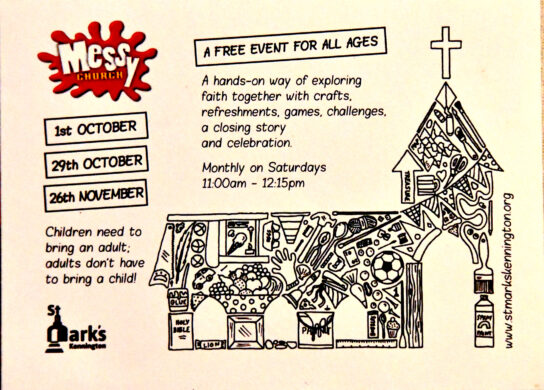
Kiri designed this flyer for our church’s Messy Church gathering. The illustration was also created by Kiri and the logo was used in line with Messy Church logo guidelines
See other creative items relating to graphic design, illustration
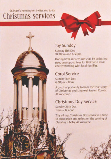
We created a small A6 flyer with details of our church’s Christmas services. The photo was taken by Steve the previous winter and Kiri did the graphic design
See other creative items relating to graphic design, photography / film
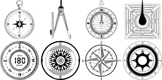
We were commissioned to re-write a website for a private tutor. The previous iteration of the website had many different illustration of a compass, but these were from different sources and in different styles. So our customer asked Kiri to put together a set of compass illustrations that would be more consistent and uniform for the new site.
See other creative items relating to illustration